
Файл:Catholicpopulationsnew.png

Учурда көрсөтүлүүчү өлчөм: 800 × 370 пиксел Башка уруксаттар: 320 × 148 пиксел | 640 × 296 пиксел | 1 357 × 628 пиксел.
Түп нуска файл (1 357 × 628 пиксель, файлдын өлчөмү: 125 KB, MIME түрү: image/png)

|
File:Catholic population.svg is a vector version of this file. It should be used in place of this PNG file when not inferior.
File:Catholicpopulationsnew.png → File:Catholic population.svg
For more information, see Help:SVG. |
 |
Жыйынтыгы
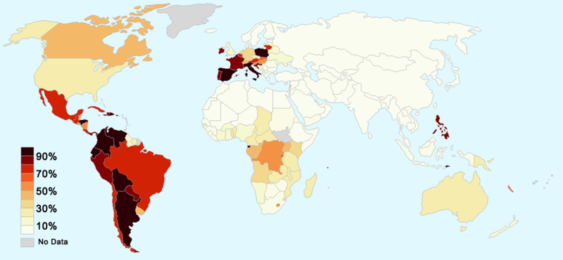
Map showing Catholics as a percentage of each country's population.
- 'Colors': more Catholics as a percentage of the population translates as darker and more reddish colors, fewer Catholics is represented in lighter and yellowish colors. The lighter colors are also slightly less saturated.
Sources
Лицензиялоо

|
Permission is granted to copy, distribute and/or modify this document under the terms of the GNU Free Documentation License, Version 1.2 or any later version published by the Free Software Foundation; with no Invariant Sections, no Front-Cover Texts, and no Back-Cover Texts. A copy of the license is included in the section entitled GNU Free Documentation License. |
| This file is licensed under the Creative Commons Attribution-Share Alike 3.0 Unported license. | ||
| ||
| This licensing tag was added to this file as part of the GFDL licensing update. |
Alternate versions
-
 Original; (this one).
 -
 Vector version.
 -
 Cropped version with alternate colors.


Файлдын тарыхы
Файлдын мурдагы нускасын көрүү үчүн тийиштүү убакыт/датаны басыңыз
| Убакыт/дата | Миниатюра | Өлчөм | Колдонуучу | Түшүндүрмө | |
|---|---|---|---|---|---|
| учурдагы | 08:53, 18 февраль 2018 | | 1 357 × 628 (125 KB) | Artoxx | Montenegro and South Sudan |
| 11:44, 18 ноябрь 2008 |  | 1 357 × 628 (121 KB) | Depositum | {{Information |Description= |Source= |Date= |Author= |Permission= |other_versions= }} | |
| 21:10, 14 октябрь 2008 |  | 1 357 × 628 (46 KB) | Moguntiner | {{Information |Description= |Source= |Date= |Author= |Permission= |other_versions= }} | |
| 14:01, 4 март 2008 |  | 1 357 × 628 (46 KB) | Moguntiner | Reverted to version as of 11:24, 17 December 2007/ please look at catholic-hierachy.org - for example in France and Austria there are much more Catholics than 30% | |
| 13:19, 16 февраль 2008 |  | 1 357 × 628 (59 KB) | Nyo~commonswiki | Revert map based on reasonable stats, figures by Eurobarometer Poll. | |
| 11:24, 17 декабрь 2007 |  | 1 357 × 628 (46 KB) | Moguntiner | Reverted to version as of 15:56, 17 October 2007 (vandalism) | |
| 17:46, 24 октябрь 2007 |  | 1 357 × 628 (59 KB) | Nyo~commonswiki | ||
| 15:56, 17 октябрь 2007 |  | 1 357 × 628 (46 KB) | Moguntiner | current version is not correct (France and Austria don't have an catholic population under 30% and so on...) | |
| 17:37, 11 октябрь 2007 |  | 1 357 × 628 (59 KB) | Nyo~commonswiki | ||
| 02:16, 3 сентябрь 2006 |  | 1 357 × 628 (46 KB) | Leinad-Z~commonswiki | a few fixes |
Шилтемелер
Бул файлды колдонгон барактар жок.
Файлдын глобалдык колдонулушу
Бул файл төмөнкү викилерде колдонулат:
- az.wikipedia.org сайтындагы колдонулушу
- hu.wikipedia.org сайтындагы колдонулушу
- mt.wikipedia.org сайтындагы колдонулушу
- sw.wikipedia.org сайтындагы колдонулушу